Problems
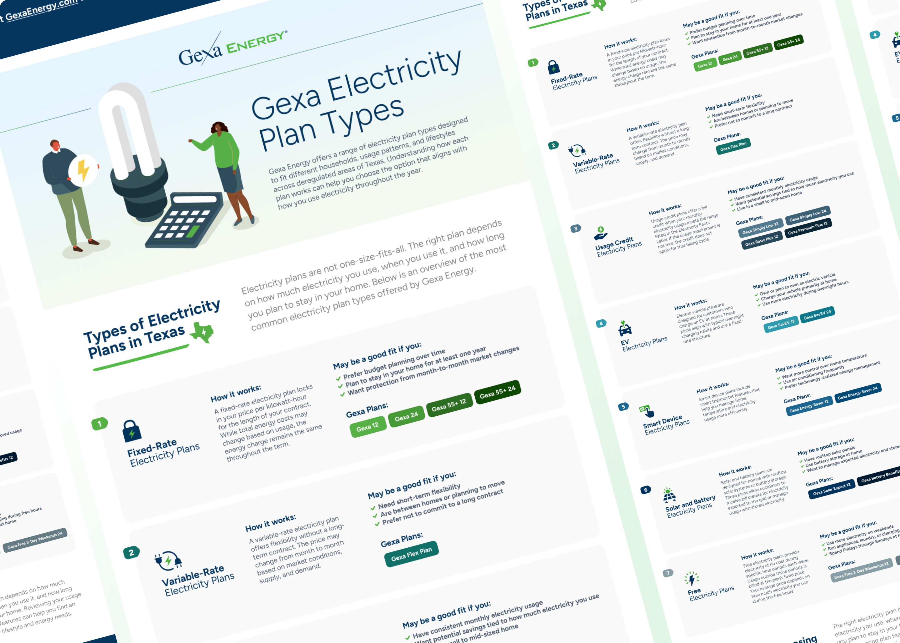
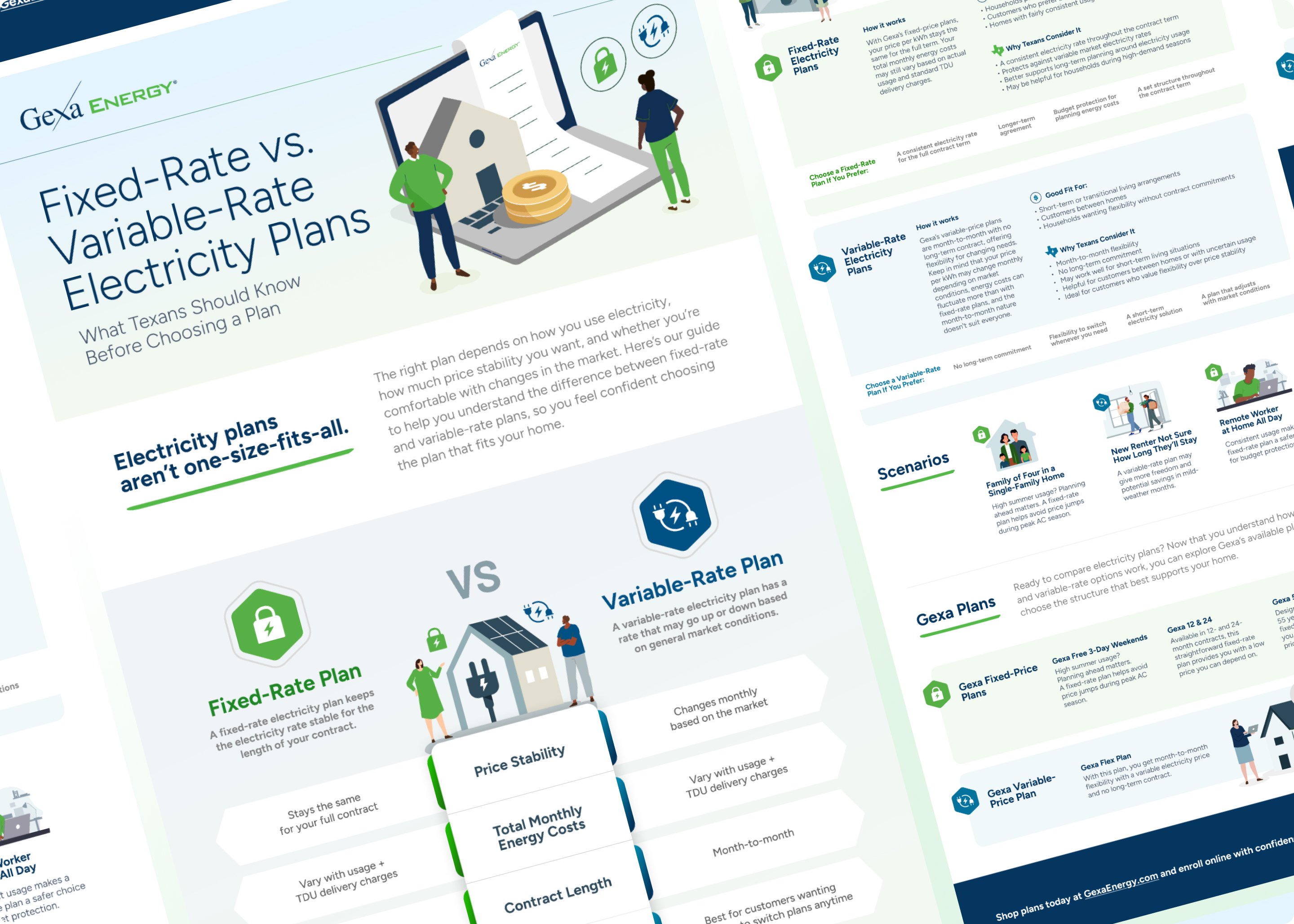
Energy plan selection is inherently complex. Customers must evaluate pricing structures, contract terms, usage variability, and risk tolerance before committing to a provider. Despite offering multiple plan types, Gexa Energy faced challenges in helping users clearly understand their options and confidently move toward conversion.
Key friction points included confusion between fixed and variable rate plans, difficulty comparing options side by side, and content that lacked visual hierarchy and intuitive flow. The journey from research to sign up was not fully optimized to guide users efficiently across blog, educational, and sales environments.
Gexa needed a system of educational assets and landing experiences that reduced cognitive load, clarified decision criteria, and supported both residential and business audiences at different stages of the funnel.
Solutions
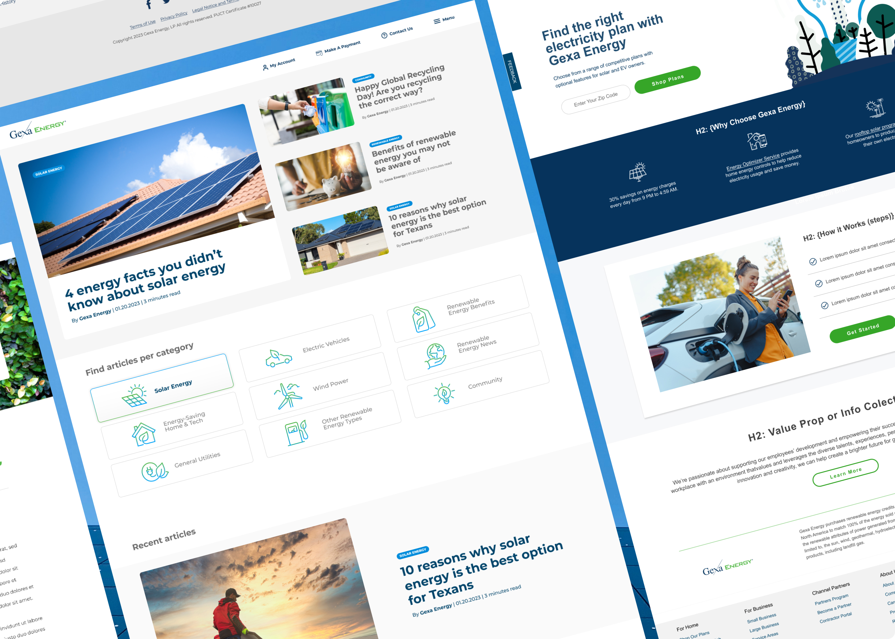
I designed a cohesive system of educational infographics and evergreen landing pages focused on clarity and conversion.
The infographics translated complex topics into clear visual frameworks, including a plan shopping checklist, fixed versus variable rate comparisons, and simplified breakdowns of plan types. These assets supported both blog education and sales enablement.
The landing pages were structured with strong information architecture, intuitive content hierarchy, and strategically placed calls to action aligned with user intent such as Compare Plans and Get Started. Every element was designed to reduce friction, improve comprehension, and encourage progression toward sign up.